

We recommend that you familiarize yourselves with UI Customization Concepts before attempting to modify any components.
Overview

- React / Next.js
- Other Frameworks
Ghost Banner

- React / Next.js
- Other Frameworks
Private Banner

- React / Next.js
- Other Frameworks
Assignee Banner

- React / Next.js
- Other Frameworks
Resolve Button (Assignee Banner)

- React / Next.js
- Other Frameworks
Unresolve Button (Assignee Banner)
- React / Next.js
- Other Frameworks
User Avatar (Assignee Banner)

- React / Next.js
- Other Frameworks
User Name (Assignee Banner)

- React / Next.js
- Other Frameworks
Header

- React / Next.js
- Other Frameworks
Status (Header)
.png?fit=max&auto=format&n=M3HkOFrkFmgstAmP&q=85&s=7d0803978f8610ab2683448c5cddd4e6)
- React / Next.js
- Other Frameworks
Trigger (Header Status)
.png?fit=max&auto=format&n=M3HkOFrkFmgstAmP&q=85&s=ce0d3445985ba8fcb9b79298ed1e07b5)
- React / Next.js
- Other Frameworks
Icon (Header Status Trigger)
.png?fit=max&auto=format&n=hSycWRXdroENArNx&q=85&s=c0c60a200a7deed41bcc2535012b9358)
- React / Next.js
- Other Frameworks
Name (Header Status Trigger)
.png?fit=max&auto=format&n=hSycWRXdroENArNx&q=85&s=922c09391bf3c6f3a306db82e2947c11)
- React / Next.js
- Other Frameworks
Arrow (Header Status Trigger)
.png?fit=max&auto=format&n=8MkfBHq5wZNT-Eu6&q=85&s=d59fb73fe569805125b683f8ebc3142f)
- React / Next.js
- Other Frameworks
Content (Header Status)
.png?fit=max&auto=format&n=hSycWRXdroENArNx&q=85&s=7868b48fa1564442d1d511b8ec2bebde)
- React / Next.js
- Other Frameworks
Item (Header Status Content)
.png?fit=max&auto=format&n=hSycWRXdroENArNx&q=85&s=84ff54875f452e71d5cb1b7f90115162)
- React / Next.js
- Other Frameworks
Icon (Header Status Content Item)
.png?fit=max&auto=format&n=hSycWRXdroENArNx&q=85&s=0ca7a4c93f1b61aa752f0552d37ce77e)
- React / Next.js
- Other Frameworks
Name (Header Status Content Item)
.png?fit=max&auto=format&n=hSycWRXdroENArNx&q=85&s=165b4b68a426bcc8585a5c5d81cbaae8)
- React / Next.js
- Other Frameworks
Priority (Header)
.png?fit=max&auto=format&n=hSycWRXdroENArNx&q=85&s=4c951e81e81a3a93b8783f88bdc15a55)
- React / Next.js
- Other Frameworks
Trigger (Header Priority)
.png?fit=max&auto=format&n=M3HkOFrkFmgstAmP&q=85&s=55f11186e8e0bb1b6a77bf8a3d783713)
- React / Next.js
- Other Frameworks
Icon (Header Priority Trigger)
.png?fit=max&auto=format&n=hSycWRXdroENArNx&q=85&s=2fef87e3d975cb5678662a103995964f)
- React / Next.js
- Other Frameworks
Name (Header Priority Trigger)
.png?fit=max&auto=format&n=hSycWRXdroENArNx&q=85&s=ca46b44770bc21768307aef006db55d9)
- React / Next.js
- Other Frameworks
Arrow (Header Priority Trigger)
.png?fit=max&auto=format&n=8MkfBHq5wZNT-Eu6&q=85&s=d9215889d4c9a33c35fb7faeb479016c)
- React / Next.js
- Other Frameworks
Content (Header Priority)
.png?fit=max&auto=format&n=hSycWRXdroENArNx&q=85&s=2237563346a33412e3f34e280f27c7ff)
- React / Next.js
- Other Frameworks
Item (Header Priority Content)
.png?fit=max&auto=format&n=hSycWRXdroENArNx&q=85&s=b37ec60cdaa2137eab08ff88eb449b6e)
- React / Next.js
- Other Frameworks
Icon (Header Priority Content Item)
.png?fit=max&auto=format&n=hSycWRXdroENArNx&q=85&s=20109d609492694238cc6b4bea847687)
- React / Next.js
- Other Frameworks
Name (Header Priority Content Item)
.png?fit=max&auto=format&n=hSycWRXdroENArNx&q=85&s=21a6ca749e9f776c5ddb97e9d1e08dcb)
- React / Next.js
- Other Frameworks
Tick (Header Priority Content Item)
.png?fit=max&auto=format&n=M3HkOFrkFmgstAmP&q=85&s=df5ce246403508c0fe57adaf8180a658)
- React / Next.js
- Other Frameworks
Options (Header)
.png?fit=max&auto=format&n=hSycWRXdroENArNx&q=85&s=a51dea97f9291478c3f66067565a653a)
- React / Next.js
- Other Frameworks
Trigger (Header Options)
.png?fit=max&auto=format&n=M3HkOFrkFmgstAmP&q=85&s=19c4029e7041318fbb7fd8af25a8fda5)
- React / Next.js
- Other Frameworks
Content (Header Options)
.png?fit=max&auto=format&n=hSycWRXdroENArNx&q=85&s=a5b0da2f8c89ecb074e7dbedb35c0888)
- React / Next.js
- Other Frameworks
Mark As Read (Header Options Content)
- React / Next.js
- Other Frameworks
Make Private (Header Options Content)
.png?fit=max&auto=format&n=hSycWRXdroENArNx&q=85&s=e8e9c979f0bdb95c24cb13e6f4bec449)
- React / Next.js
- Other Frameworks
Enable (Header Options Content Make Private)
.png?fit=max&auto=format&n=hSycWRXdroENArNx&q=85&s=fd7c12f935c9148d9c0999eb9ffee187)
- React / Next.js
- Other Frameworks
Disable (Header Options Content Make Private)
.png?fit=max&auto=format&n=hSycWRXdroENArNx&q=85&s=4170c84a5c46847d6c88ce20c6ba7925)
- React / Next.js
- Other Frameworks
Assign (Header Options Content)
.png?fit=max&auto=format&n=8MkfBHq5wZNT-Eu6&q=85&s=cb00a35172590e8b6a2178a12ede7f7d)
- React / Next.js
- Other Frameworks
Edit (Header Options Content)
.png?fit=max&auto=format&n=hSycWRXdroENArNx&q=85&s=41463240721850d21092f1432212fde0)
- React / Next.js
- Other Frameworks
Delete (Header Options Content)
.png?fit=max&auto=format&n=hSycWRXdroENArNx&q=85&s=9dddcef57aa15b8ea1dec55438127b12)
- React / Next.js
- Other Frameworks
Thread (Header Options Content Delete)
- React / Next.js
- Other Frameworks
Comment (Header Options Content Delete)
- React / Next.js
- Other Frameworks
Notification (Header Options Content)
.png?fit=max&auto=format&n=hSycWRXdroENArNx&q=85&s=01ed47b633e4281923dfe8b32e164cad)
- React / Next.js
- Other Frameworks
Subscribe (Header Options Content Notification)
.png?fit=max&auto=format&n=M3HkOFrkFmgstAmP&q=85&s=0a1558696603946a27d91b853d1aca3e)
- React / Next.js
- Other Frameworks
Unsubscribe (Header Options Content Notification)
.png?fit=max&auto=format&n=M3HkOFrkFmgstAmP&q=85&s=e4ed83bcbd7c5a56b4dcd26a2b8b7c2b)
- React / Next.js
- Other Frameworks
Copy Link (Header)
.png?fit=max&auto=format&n=hSycWRXdroENArNx&q=85&s=db2ca5ff5afd6070a52461b7406d7c94)
- React / Next.js
- Other Frameworks
Resolve Button (Header)
.png?fit=max&auto=format&n=hSycWRXdroENArNx&q=85&s=fc3241a09c75055d3fbb73f6b37102eb)
- React / Next.js
- Other Frameworks
Custom Annotation Dropdown (Header)
.png?fit=max&auto=format&n=hSycWRXdroENArNx&q=85&s=222ec0b2d5ce82ca0daec1a09d5c8f2a)
- React / Next.js
- Other Frameworks
Trigger (Header Custom Annotation Dropdown)
.png?fit=max&auto=format&n=M3HkOFrkFmgstAmP&q=85&s=b8b49554ed491118470a58d8a9136a31)
- React / Next.js
- Other Frameworks
List (Header Custom Annotation Dropdown Trigger)
.png?fit=max&auto=format&n=hSycWRXdroENArNx&q=85&s=cc0ae6ce1d5db0f723042f4ac4a78193)
- React / Next.js
- Other Frameworks
Item (Header Custom Annotation Dropdown Trigger List)
- React / Next.js
- Other Frameworks
Remaining Count (Header Custom Annotation Dropdown Trigger)
.png?fit=max&auto=format&n=hSycWRXdroENArNx&q=85&s=c0564133929d5868cd28b54ca87ae84b)
- React / Next.js
- Other Frameworks
Placeholder (Header Custom Annotation Dropdown Trigger)
.png?fit=max&auto=format&n=hSycWRXdroENArNx&q=85&s=477c9310fe17734378d51664810bb408)
- React / Next.js
- Other Frameworks
Arrow (Header Custom Annotation Dropdown Trigger)
.png?fit=max&auto=format&n=8MkfBHq5wZNT-Eu6&q=85&s=14c4605c96c198ebd341fa0dff9d60ba)
- React / Next.js
- Other Frameworks
Content (Header Custom Annotation Dropdown)
.png?fit=max&auto=format&n=hSycWRXdroENArNx&q=85&s=2c1bb6ea4eef87b4445cb566bd565bcd)
- React / Next.js
- Other Frameworks
Item (Header Custom Annotation Dropdown Content)
.png?fit=max&auto=format&n=hSycWRXdroENArNx&q=85&s=735ada12a3b54eb8b86042e25da35770)
- React / Next.js
- Other Frameworks
Label (Header Custom Annotation Dropdown Content Item)
.png?fit=max&auto=format&n=hSycWRXdroENArNx&q=85&s=4fda6c51137b88cde27fa61f6b87254b)
- React / Next.js
- Other Frameworks
Icon (Header Custom Annotation Dropdown Content Item)
.png?fit=max&auto=format&n=hSycWRXdroENArNx&q=85&s=eb6f2aa07ed3805fd6ce9b87ae2b7bbe)
- React / Next.js
- Other Frameworks
Comment Index (Header)
.png?fit=max&auto=format&n=hSycWRXdroENArNx&q=85&s=782f9b7db4306d97ee6411111d96f842)
- React / Next.js
- Other Frameworks
Comment Number (Header)
The annotation number displays in the comment dialog header, providing a persistent identifier for each comment that remains constant across sessions. This number makes it easy to reference specific comments in team discussions or documentation.- React / Next.js
- Other Frameworks
Comment Category (Header)
.png?fit=max&auto=format&n=hSycWRXdroENArNx&q=85&s=3c433d5e3f66de3cca6d54da68fcfad5)
- React / Next.js
- Other Frameworks
Comment Suggestion Status (Header)
.png?fit=max&auto=format&n=hSycWRXdroENArNx&q=85&s=8d5cdc4f13ac7b079fd2f83977bb475b)
- React / Next.js
- Other Frameworks
Navigation Button (Header)
.png?fit=max&auto=format&n=hSycWRXdroENArNx&q=85&s=2f46735fd58decb262e28094d1754687)
- React / Next.js
- Other Frameworks
Private Badge

- React / Next.js
- Other Frameworks
Body

- React / Next.js
- Other Frameworks
Threads (Body)
.png?fit=max&auto=format&n=M3HkOFrkFmgstAmP&q=85&s=473b418c96d0409a0a6ed71b7f162a6b)
- React / Next.js
- Other Frameworks
Thread Card (Body Threads)
.png?fit=max&auto=format&n=M3HkOFrkFmgstAmP&q=85&s=55a8289e26eb12409b76ec48686d7298)
- React / Next.js
- Other Frameworks
Avatar (Body Threads Thread Card)
.png?fit=max&auto=format&n=hSycWRXdroENArNx&q=85&s=19890b7c5fdc8545da1819737f9983a5)
- React / Next.js
- Other Frameworks
Name (Body Threads Thread Card)
.png?fit=max&auto=format&n=hSycWRXdroENArNx&q=85&s=a28ae2a2e30665fa7da7d14c4ab71256)
- React / Next.js
- Other Frameworks
Unread (Body Threads Thread Card)
.png?fit=max&auto=format&n=M3HkOFrkFmgstAmP&q=85&s=271332c36e2ab8ad65e612ca176f6f95)
- React / Next.js
- Other Frameworks
Seen Dropdown (Body Threads Thread Card)
.png?fit=max&auto=format&n=M3HkOFrkFmgstAmP&q=85&s=4cc6f73ccf84e9bcdc81a1d6b574f79e)
- React / Next.js
- Other Frameworks
Trigger (Body Threads Thread Card Seen Dropdown)
.png?fit=max&auto=format&n=M3HkOFrkFmgstAmP&q=85&s=9b3ff6bba5a9d8ab53a0c2ad43987d30)
- React / Next.js
- Other Frameworks
Content (Body Threads Thread Card Seen Dropdown)
.png?fit=max&auto=format&n=hSycWRXdroENArNx&q=85&s=63a0a23a65bcd24e629885a1180d8820)
- React / Next.js
- Other Frameworks
Title (Body Threads Thread Card Seen Dropdown Content)
.png?fit=max&auto=format&n=M3HkOFrkFmgstAmP&q=85&s=9bf68622acb68d604f1505c60ae0eb98)
- React / Next.js
- Other Frameworks
Items (Body Threads Thread Card Seen Dropdown Content)
.png?fit=max&auto=format&n=hSycWRXdroENArNx&q=85&s=1611aec6f0a1332ed6693cb88bf28641)
- React / Next.js
- Other Frameworks
Item (Body Threads Thread Card Seen Dropdown Content Items)
.png?fit=max&auto=format&n=hSycWRXdroENArNx&q=85&s=fab5a45c5d32c35d7a505471aec87b91)
- React / Next.js
- Other Frameworks
Time (Body Threads Thread Card Seen Dropdown Content Items Item)
.png?fit=max&auto=format&n=M3HkOFrkFmgstAmP&q=85&s=5b2923b12c78651ac4a5a6540692ca3e)
- React / Next.js
- Other Frameworks
Name (Body Threads Thread Card Seen Dropdown Content Items Item)
.png?fit=max&auto=format&n=hSycWRXdroENArNx&q=85&s=edf83a1d56c9c02e25d96bc495d352d1)
- React / Next.js
- Other Frameworks
Avatar (Body Threads Thread Card Seen Dropdown Content Items Item)
.png?fit=max&auto=format&n=8MkfBHq5wZNT-Eu6&q=85&s=dac1a155d8ac172aae8e5bd0d2f5d85d)
- React / Next.js
- Other Frameworks
Time (Body Threads Thread Card)
.png?fit=max&auto=format&n=M3HkOFrkFmgstAmP&q=85&s=03f3e2b9b6b29e1a6ec5a3396b7010c7)
- React / Next.js
- Other Frameworks
Device Type (Body Threads Thread Card)
.png?fit=max&auto=format&n=hSycWRXdroENArNx&q=85&s=03f73bc3ad67f9ce9f33a1df0cbe3e5f)
- React / Next.js
- Other Frameworks
Edited (Body Threads Thread Card)
.png?fit=max&auto=format&n=hSycWRXdroENArNx&q=85&s=c7a93d9a25ced4e20915e5df2af42867)
- React / Next.js
- Other Frameworks
Options (Body Threads Thread Card)
.png?fit=max&auto=format&n=hSycWRXdroENArNx&q=85&s=900c79f2f65ab5b3fc9ea43b643a20cf)
- React / Next.js
- Other Frameworks
Trigger (Body Threads Thread Card Options)
.png?fit=max&auto=format&n=M3HkOFrkFmgstAmP&q=85&s=9f97770f28fee6357e2bfce81f5dad9b)
- React / Next.js
- Other Frameworks
Content (Body Threads Thread Card Options)
.png?fit=max&auto=format&n=hSycWRXdroENArNx&q=85&s=07eb3a8fbab8dec7dae3c636234c67b6)
- React / Next.js
- Other Frameworks
Mark As Read (Body Threads Thread Card Options Content)
- React / Next.js
- Other Frameworks
Edit (Body Threads Thread Card Options Content)
.png?fit=max&auto=format&n=hSycWRXdroENArNx&q=85&s=b3beb8a6273cb6008288b4de40982c63)
- React / Next.js
- Other Frameworks
Delete (Body Threads Thread Card Options Content)
.png?fit=max&auto=format&n=hSycWRXdroENArNx&q=85&s=942e489b01918d93c44cfacf35819fc5)
- React / Next.js
- Other Frameworks
Thread (Body Threads Thread Card Options Content Delete)
- React / Next.js
- Other Frameworks
Comment (Body Threads Thread Card Options Content Delete)
- React / Next.js
- Other Frameworks
Message (Body Threads Thread Card)
.png?fit=max&auto=format&n=hSycWRXdroENArNx&q=85&s=9b3a249f2eae3f7da421c8d396337348)
- React / Next.js
- Other Frameworks
ShowMore (Body Threads Thread Card Message)
Visible when message truncation is enabled and the message exceeds the line limit. Clicking expands the message.- React / Next.js
- Other Frameworks
ShowLess (Body Threads Thread Card Message)
Visible when an expanded truncated message is shown. Clicking collapses it back.- React / Next.js
- Other Frameworks
EditComposer (Body Threads Thread Card)
Conditionally renders when a comment is being edited.- React / Next.js
- Other Frameworks
Reaction Tool (Body Threads Thread Card)
.png?fit=max&auto=format&n=hSycWRXdroENArNx&q=85&s=be9572273fa48aa2afb01454e4d32a1a)
excludeReactionIds to hide specific reactions from the reaction picker.
- React / Next.js
- Other Frameworks
Reactions (Body Threads Thread Card)
.png?fit=max&auto=format&n=hSycWRXdroENArNx&q=85&s=4cfa2e21a163a1f9feff03096bd90443)
excludeReactionIds to hide specific reactions from display.
- React / Next.js
- Other Frameworks
ReactionPin (Body Threads Thread Card)
Display a specific reaction as a pinned standalone element.- React / Next.js
- Other Frameworks
reactionId(IVeltCommentDialogThreadCardReactionPinProps): Unique identifier of the reaction to pin and display
Attachments (Body Threads Thread Card)
.png?fit=max&auto=format&n=8MkfBHq5wZNT-Eu6&q=85&s=756328916e8ba1ccee17b31bd1659a83)
- React / Next.js
- Other Frameworks
Image (Body Threads Thread Card Attachments)
.png?fit=max&auto=format&n=hSycWRXdroENArNx&q=85&s=a9d7e12867af19448cdbd4a8ffebd9d8)
- React / Next.js
- Other Frameworks
Preview (Body Threads Thread Card Attachments Image)
.png?fit=max&auto=format&n=hSycWRXdroENArNx&q=85&s=389651f68c9859c8a4cb42cd495bc165)
- React / Next.js
- Other Frameworks
Delete (Body Threads Thread Card Attachments Image)
.png?fit=max&auto=format&n=hSycWRXdroENArNx&q=85&s=edeb6b7af9c93dd1f4e54f22daaea13a)
- React / Next.js
- Other Frameworks
Download (Body Threads Thread Card Attachments Image)
.png?fit=max&auto=format&n=hSycWRXdroENArNx&q=85&s=41a0902b64ac88e4faed20a0fef2cdea)
- React / Next.js
- Other Frameworks
Other (Body Threads Thread Card Attachments)
.png?fit=max&auto=format&n=hSycWRXdroENArNx&q=85&s=ba3b3d5730b0edf85e5f98a3aeaa20f5)
- React / Next.js
- Other Frameworks
Delete (Body Threads Thread Card Attachments Other)
.png?fit=max&auto=format&n=hSycWRXdroENArNx&q=85&s=f9d78e00444d9cebc85aed25aae6aaff)
- React / Next.js
- Other Frameworks
Download (Body Threads Thread Card Attachments Other)
.png?fit=max&auto=format&n=hSycWRXdroENArNx&q=85&s=cad582cc93dff11d6d4f2cf93e0f36dc)
- React / Next.js
- Other Frameworks
Icon (Body Threads Thread Card Attachments Other)
.png?fit=max&auto=format&n=hSycWRXdroENArNx&q=85&s=749123010782397ac3f887418fac37fd)
- React / Next.js
- Other Frameworks
Name (Body Threads Thread Card Attachments Other)
.png?fit=max&auto=format&n=hSycWRXdroENArNx&q=85&s=f3388fe39bac8d3081238f0f2d5a7bf6)
- React / Next.js
- Other Frameworks
Size (Body Threads Thread Card Attachments Other)
.png?fit=max&auto=format&n=M3HkOFrkFmgstAmP&q=85&s=7684cb15fa5a157f9ac52a98c56db779)
- React / Next.js
- Other Frameworks
Recordings (Body Threads Thread Card)
.png?fit=max&auto=format&n=hSycWRXdroENArNx&q=85&s=7b90b57ef87ec59b87dc50d6d120bb6f)
- React / Next.js
- Other Frameworks
Autocomplete Chip Tooltip (Body Threads Thread Card)
.png?fit=max&auto=format&n=8MkfBHq5wZNT-Eu6&q=85&s=abda52f0917b079e34cddd8e361b1884)
- React / Next.js
- Other Frameworks
Icon (Body Threads Thread Card Autocomplete Chip Tooltip)
.png?fit=max&auto=format&n=hSycWRXdroENArNx&q=85&s=f34622be83b022ae3b67cb83f138e60c)
- React / Next.js
- Other Frameworks
Name (Body Threads Thread Card Autocomplete Chip Tooltip)
.png?fit=max&auto=format&n=hSycWRXdroENArNx&q=85&s=b6b75620ae73148bbf924fa14e204344)
- React / Next.js
- Other Frameworks
Description (Body Threads Thread Card Autocomplete Chip Tooltip)
.png?fit=max&auto=format&n=hSycWRXdroENArNx&q=85&s=7573e4ee8a2818bf44af5c34fbd17c55)
- React / Next.js
- Other Frameworks
Reactions Panel (Body Threads Thread Card)
.png?fit=max&auto=format&n=hSycWRXdroENArNx&q=85&s=9ffcd766e9bcf5338bdb1b291476c231)
- React / Next.js
- Other Frameworks
Items (Body Threads Thread Card Reactions Panel)
.png?fit=max&auto=format&n=hSycWRXdroENArNx&q=85&s=d20d4dae3cf06aea3dcd5f191efe9d3a)
- React / Next.js
- Other Frameworks
Item (Body Threads Thread Card Reactions Panel Items)
.png?fit=max&auto=format&n=hSycWRXdroENArNx&q=85&s=d6f1ab4574b3698131231053ac7ba5d7)
- React / Next.js
- Other Frameworks
Emoji (Body Threads Thread Card Reactions Panel Items Item)
.png?fit=max&auto=format&n=hSycWRXdroENArNx&q=85&s=fa9022b9c190a43d7b0c1821430e2394)
- React / Next.js
- Other Frameworks
Reaction Pin (Body Threads Thread Card)
.png?fit=max&auto=format&n=hSycWRXdroENArNx&q=85&s=cbf495c0968d2ce82966bc99a357bde2)
- React / Next.js
- Other Frameworks
Emoji (Body Threads Thread Card Reaction Pin)
.png?fit=max&auto=format&n=hSycWRXdroENArNx&q=85&s=0ae6b5566d245759d9124825f8d2d675)
- React / Next.js
- Other Frameworks
Count (Body Threads Thread Card Reaction Pin)
.png?fit=max&auto=format&n=hSycWRXdroENArNx&q=85&s=39f911d20bcaadb3ec309698b06d7058)
- React / Next.js
- Other Frameworks
Reaction Pin Tooltip (Body Threads Thread Card)
.png?fit=max&auto=format&n=hSycWRXdroENArNx&q=85&s=3f5c03ba36f008ea8289dbcd261f61cd)
- React / Next.js
- Other Frameworks
Users (Body Threads Thread Card Reaction Pin Tooltip)
.png?fit=max&auto=format&n=M3HkOFrkFmgstAmP&q=85&s=04cd9d7627dd83b25c95003f38b568cd)
- React / Next.js
- Other Frameworks
User (Body Threads Thread Card Reaction Pin Tooltip Users)
.png?fit=max&auto=format&n=M3HkOFrkFmgstAmP&q=85&s=6b4744427d6c35fbc2dece764cd64a62)
- React / Next.js
- Other Frameworks
Avatar (Body Threads Thread Card Reaction Pin Tooltip Users User)
.png?fit=max&auto=format&n=8MkfBHq5wZNT-Eu6&q=85&s=2dce2aa015124b19c12d6a1d42a65e53)
- React / Next.js
- Other Frameworks
Name (Body Threads Thread Card Reaction Pin Tooltip Users User)
.png?fit=max&auto=format&n=hSycWRXdroENArNx&q=85&s=d50ce2b6dbc75559afd65461b2417f48)
- React / Next.js
- Other Frameworks
Reaction Tool (Body Threads Thread Card)
- React / Next.js
- Other Frameworks
Reply (Body Threads Thread Card)
The Reply component provides a quick reply button on each comment thread card, enabling users to respond directly without expanding the full comment dialog. This streamlines the commenting workflow in collaborative environments. This button is hidden by default and can be enabled through wireframe customization.- React / Next.js
- Other Frameworks
Assign Button (Body Threads Thread Card)
The Assign Button component allows you to customize the assign button that appears on individual comment thread cards.- React / Next.js
- Other Frameworks
MoreReply (Body Threads)
.png?fit=max&auto=format&n=hSycWRXdroENArNx&q=85&s=19ce6b30e92735c46faa65b454159d80)
- React / Next.js
- Other Frameworks
Reply Avatars (Body)
.png?fit=max&auto=format&n=hSycWRXdroENArNx&q=85&s=161600b7032c576e86a8b8401d02d89b)
- React / Next.js
- Other Frameworks
List (Body Reply Avatars)
.png?fit=max&auto=format&n=hSycWRXdroENArNx&q=85&s=035389e664d9025cabc6291d4d7cd1ea)
- React / Next.js
- Other Frameworks
Item (Body Reply Avatars List)
.png?fit=max&auto=format&n=hSycWRXdroENArNx&q=85&s=3b318c07f87cae20c7b0a4e4157d7a68)
- React / Next.js
- Other Frameworks
Remaining Count (Body Reply Avatars)
.png?fit=max&auto=format&n=hSycWRXdroENArNx&q=85&s=6b7eab1d10deac3490efb51599309513)
- React / Next.js
- Other Frameworks
Toggle Reply (Body)
.png?fit=max&auto=format&n=M3HkOFrkFmgstAmP&q=85&s=a53b5590deb13646d9fb7ca6c33504cb)
- React / Next.js
- Other Frameworks
Icon (Body Toggle Reply)
.png?fit=max&auto=format&n=hSycWRXdroENArNx&q=85&s=70d256321a650d1b74d7265c4500d6da)
- React / Next.js
- Other Frameworks
Count (Body Toggle Reply)
.png?fit=max&auto=format&n=hSycWRXdroENArNx&q=85&s=863a6e5c28c21c3869c1b0dd3fde72d1)
- React / Next.js
- Other Frameworks
Text (Body Toggle Reply)
.png?fit=max&auto=format&n=M3HkOFrkFmgstAmP&q=85&s=354b28a74268cdd4acd36ac521d1a1cc)
- React / Next.js
- Other Frameworks
Hide Reply (Body)
The Hide Reply component adds a button to hide replies in the comment dialog, letting you control when replies are visible to match your workflow.- React / Next.js
- Other Frameworks
Composer

- React / Next.js
- Other Frameworks
Avatar (Composer)
.png?fit=max&auto=format&n=hSycWRXdroENArNx&q=85&s=56e7abb88a649b0a7d056685a340b4d8)
- React / Next.js
- Other Frameworks
Attachments (Composer)
.png?fit=max&auto=format&n=8MkfBHq5wZNT-Eu6&q=85&s=2214447e805c46f5412a0814145f8216)
- React / Next.js
- Other Frameworks
Selected (Composer Attachments)
.png?fit=max&auto=format&n=M3HkOFrkFmgstAmP&q=85&s=9428faab24f680b69a730bbbe79f633d)
- React / Next.js
- Other Frameworks
Image (Composer Attachments Selected)
.png?fit=max&auto=format&n=hSycWRXdroENArNx&q=85&s=debdab89d943ad9720d60b1c5e4f6d29)
- React / Next.js
- Other Frameworks
Other (Composer Attachments Selected)
.png?fit=max&auto=format&n=hSycWRXdroENArNx&q=85&s=db3b1a10f70e8be8e8fa022a3e5d0f96)
- React / Next.js
- Other Frameworks
Invalid (Composer Attachments)
.png?fit=max&auto=format&n=hSycWRXdroENArNx&q=85&s=c7d0add2663afd6016aff0a87debd90d)
- React / Next.js
- Other Frameworks
Item (Composer Attachments Invalid)
- React / Next.js
- Other Frameworks
Download (Composer Attachments Image)
- React / Next.js
- Other Frameworks
Download (Composer Attachments Other)
- React / Next.js
- Other Frameworks
Recordings (Composer)
.png?fit=max&auto=format&n=hSycWRXdroENArNx&q=85&s=348ddf284ef9447cc13e458809b96e76)
- React / Next.js
- Other Frameworks
Input (Composer)
.png?fit=max&auto=format&n=hSycWRXdroENArNx&q=85&s=df0be1443ee7f6b4e3ffb001ccf4f09f)
- React / Next.js
- Other Frameworks
Format Toolbar (Composer)
The format toolbar contains text formatting buttons (bold, italic, underline, strikethrough).- React / Next.js
- Other Frameworks
Button (Composer Format Toolbar)
Individual format button with type:bold, italic, underline, or strikethrough.
- React / Next.js
- Other Frameworks
Action Button (Composer)
Supports types:autocomplete, file, attachments, audio, video, screen, format, submit.
- React / Next.js
- Other Frameworks
Assign User (Composer)
.png?fit=max&auto=format&n=8MkfBHq5wZNT-Eu6&q=85&s=62c3876327539e13fb9cd3d5767c8fa4)
- React / Next.js
- Other Frameworks
Visibility Dropdown (Composer)
- React / Next.js
- Other Frameworks
Trigger (Composer Visibility Dropdown)
- React / Next.js
- Other Frameworks
Label (Composer Visibility Dropdown Trigger)
- React / Next.js
- Other Frameworks
Icon (Composer Visibility Dropdown Trigger)
- React / Next.js
- Other Frameworks
Content (Composer Visibility Dropdown)
- React / Next.js
- Other Frameworks
Public (Composer Visibility Dropdown Content)
- React / Next.js
- Other Frameworks
Private (Composer Visibility Dropdown Content)
- React / Next.js
- Other Frameworks
Autocomplete Option (Composer)
For standalone autocomplete primitive components (e.g.,
VeltAutocompleteOption, VeltAutocompleteChip), see the Autocomplete Primitives section..png?fit=max&auto=format&n=8MkfBHq5wZNT-Eu6&q=85&s=13a63eb0f280c0baa93051233324addd)
- React / Next.js
- Other Frameworks
Icon (Composer Autocomplete Option)
.png?fit=max&auto=format&n=hSycWRXdroENArNx&q=85&s=d0e306a1864d09ffa8cf41e00a4d7681)
- React / Next.js
- Other Frameworks
Name (Composer Autocomplete Option)
.png?fit=max&auto=format&n=hSycWRXdroENArNx&q=85&s=72f7d96ac6cf615bf71929ac5694b3ef)
- React / Next.js
- Other Frameworks
Description (Composer Autocomplete Option)
.png?fit=max&auto=format&n=hSycWRXdroENArNx&q=85&s=faf14e3b076b9c49e6c1c86612886018)
- React / Next.js
- Other Frameworks
Error Icon (Composer Autocomplete Option)
.png?fit=max&auto=format&n=hSycWRXdroENArNx&q=85&s=11a3c833334f48698a344da28bf2db08)
- React / Next.js
- Other Frameworks
Autocomplete Group Option (Composer)
.png?fit=max&auto=format&n=8MkfBHq5wZNT-Eu6&q=85&s=bb855edbf458b1d08f859b219959bbd6)
- React / Next.js
- Other Frameworks
Visibility Banner
Displays below the composer to let users set per-comment visibility. TheselectedVisibility data variable exposes the current CommentVisibilityOptionType.
- React / Next.js
- Other Frameworks
Icon (Visibility Banner)
- React / Next.js
- Other Frameworks
Text (Visibility Banner)
- React / Next.js
- Other Frameworks
Dropdown (Visibility Banner)
- React / Next.js
- Other Frameworks
Trigger (Visibility Banner Dropdown)
- React / Next.js
- Other Frameworks
Label (Visibility Banner Dropdown Trigger)
- React / Next.js
- Other Frameworks
AvatarList (Visibility Banner Dropdown Trigger)
- React / Next.js
- Other Frameworks
- React / Next.js
- Other Frameworks
- React / Next.js
- Other Frameworks
Icon (Visibility Banner Dropdown Trigger)
- React / Next.js
- Other Frameworks
Content (Visibility Banner Dropdown)
- React / Next.js
- Other Frameworks
Item (Visibility Banner Dropdown Content)
Acceptstype: 'public' | 'org-users' | 'personal' | 'selected-people'.
- React / Next.js
- Other Frameworks
- React / Next.js
- Other Frameworks
- React / Next.js
- Other Frameworks
UserPicker (Visibility Banner Dropdown Content)
- React / Next.js
- Other Frameworks
- React / Next.js
- Other Frameworks
- React / Next.js
- Other Frameworks
- React / Next.js
- Other Frameworks
- React / Next.js
- Other Frameworks
- React / Next.js
- Other Frameworks
- React / Next.js
- Other Frameworks
- React / Next.js
- Other Frameworks
- React / Next.js
- Other Frameworks
- React / Next.js
- Other Frameworks
- React / Next.js
- Other Frameworks
All Comment

- React / Next.js
- Other Frameworks
Approve

- React / Next.js
- Other Frameworks
Sign In

- React / Next.js
- Other Frameworks
Upgrade

- React / Next.js
- Other Frameworks
Suggestion Action

- React / Next.js
- Other Frameworks
Accept (Suggestion Action)
.png?fit=max&auto=format&n=8MkfBHq5wZNT-Eu6&q=85&s=9537a960f2a8cb2a38dd01440f2ba176)
- React / Next.js
- Other Frameworks
Reject (Suggestion Action)
.png?fit=max&auto=format&n=hSycWRXdroENArNx&q=85&s=9c543498861a2d47caf8c98858b7b476)
- React / Next.js
- Other Frameworks
Styling
Disable ShadowDOM
- By default, ShadowDOM is used to ensure that your app’s CSS does not interfere with the styling of the SDK components.
- Disable the shadow dom to apply your custom CSS to the component.
Default: true
- React / Next.js
- Other Frameworks
Example
API methods
Dark Mode
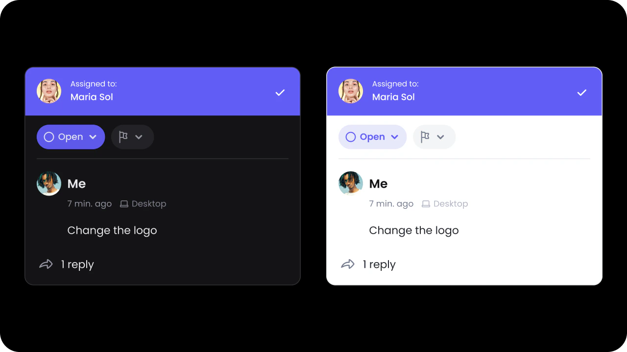
Default: false
Below are the examples to enable Dark Mode for comments dialog:
- React / Next.js
- Other Frameworks
Example
API methods
Pre-defined Variants
The Comment Dialog has 2 pre-defined variants:dialog: this will customize the Comment Dialog only within Pin, Area, and Text Commentssidebar: this will customize the Comment Dialog only within Sidebar comments
variant name in the wireframe template equal to one of the pre-defined variants. You do not need to add it to the actual Velt component.
- React / Next.js
- Other Frameworks
React / Next.js