

We recommend that you familiarize yourselves with UI Customization Concepts before attempting to modify any components.
Overview
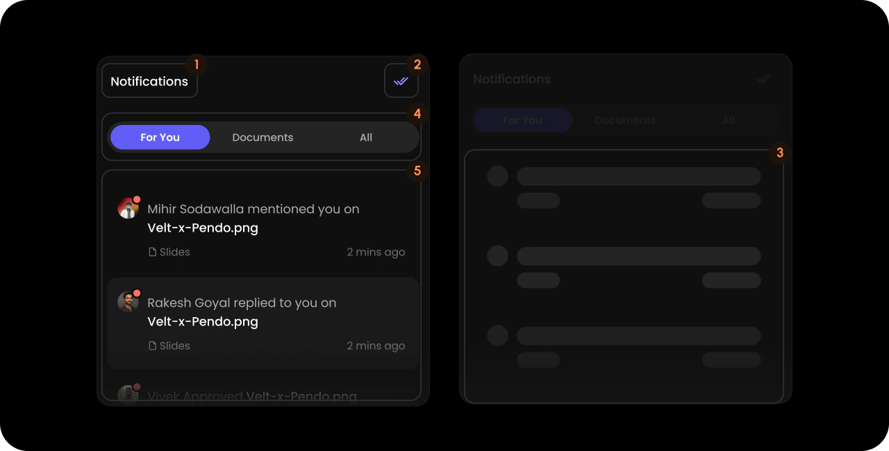
- React / Next.js
- Other Frameworks
<VeltWireframe>
    <VeltNotificationsPanelWireframe>
        <VeltNotificationsPanelWireframe.Title />
        <VeltNotificationsPanelWireframe.ReadAllButton />
        <VeltNotificationsPanelWireframe.SettingsButton />
        <VeltNotificationsPanelWireframe.Skeleton />
        <VeltNotificationsPanelWireframe.Header />
        <VeltNotificationsPanelWireframe.Content />
        <VeltNotificationsPanelWireframe.Settings />
    </VeltNotificationsPanelWireframe>
</VeltWireframe>
<velt-wireframe style="display:none;">
    <velt-notifications-panel-wireframe>
        <velt-notifications-panel-title-wireframe></velt-notifications-panel-title-wireframe>
        <velt-notifications-panel-read-all-button-wireframe></velt-notifications-panel-read-all-button-wireframe>
        <velt-notifications-panel-settings-button-wireframe></velt-notifications-panel-settings-button-wireframe>
        <velt-notifications-panel-skeleton-wireframe></velt-notifications-panel-skeleton-wireframe>
        <velt-notifications-panel-header-wireframe></velt-notifications-panel-header-wireframe>
        <velt-notifications-panel-content-wireframe></velt-notifications-panel-content-wireframe>
        <velt-notifications-panel-settings-wireframe></velt-notifications-panel-settings-wireframe>
    </velt-notifications-panel-wireframe>
</velt-wireframe>
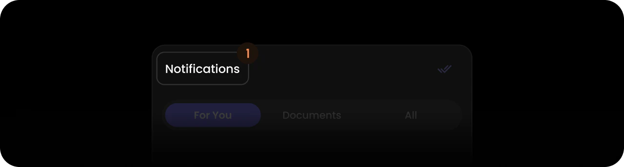
Title
- React / Next.js
- Other Frameworks
<VeltWireframe>
    <VeltNotificationsPanelWireframe.Title />
</VeltWireframe>
<velt-wireframe style="display:none;">
    <velt-notifications-panel-title-wireframe></velt-notifications-panel-title-wireframe>
</velt-wireframe>
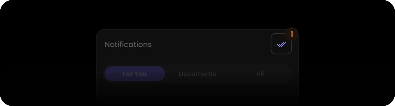
ReadAllButton
- React / Next.js
- Other Frameworks
<VeltWireframe>
    <VeltNotificationsPanelWireframe.ReadAllButton />
</VeltWireframe>
<velt-wireframe style="display:none;">
    <velt-notifications-panel-read-all-button-wireframe></velt-notifications-panel-read-all-button-wireframe>
</velt-wireframe>
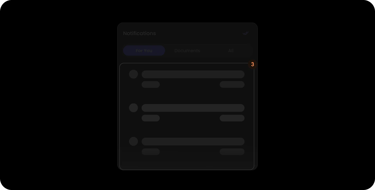
Skeleton
- React / Next.js
- Other Frameworks
<VeltWireframe>
    <VeltNotificationsPanelWireframe.Skeleton />
</VeltWireframe>
<velt-wireframe style="display:none;">
    <velt-notifications-panel-skeleton-wireframe></velt-notifications-panel-skeleton-wireframe>
</velt-wireframe>
Header
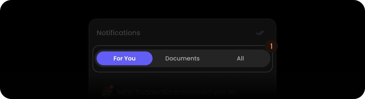
- React / Next.js
- Other Frameworks
<VeltWireframe>
    <VeltNotificationsPanelWireframe.Header>
        <VeltNotificationsPanelWireframe.Header.TabAll />
        <VeltNotificationsPanelWireframe.Header.TabDocuments />
        <VeltNotificationsPanelWireframe.Header.TabForYou />
        <VeltNotificationsPanelWireframe.Header.TabPeople />
    </VeltNotificationsPanelWireframe.Header>
</VeltWireframe>
<velt-wireframe style="display:none;">
    <velt-notifications-panel-header-wireframe>
        <velt-notifications-panel-header-tab-all-wireframe></velt-notifications-panel-header-tab-all-wireframe>
        <velt-notifications-panel-header-tab-documents-wireframe></velt-notifications-panel-header-tab-documents-wireframe>
        <velt-notifications-panel-header-tab-for-you-wireframe></velt-notifications-panel-header-tab-for-you-wireframe>
        <velt-notifications-panel-header-tab-people-wireframe></velt-notifications-panel-header-tab-people-wireframe>
    </velt-notifications-panel-header-wireframe>
</velt-wireframe>
TabAll
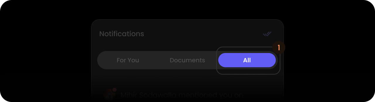
- React / Next.js
- Other Frameworks
<VeltWireframe>
    <VeltNotificationsPanelWireframe.Header.TabAll />
</VeltWireframe>
<velt-wireframe style="display:none;">
    <velt-notifications-panel-header-tab-all-wireframe></velt-notifications-panel-header-tab-all-wireframe>
</velt-wireframe>
TabDocuments
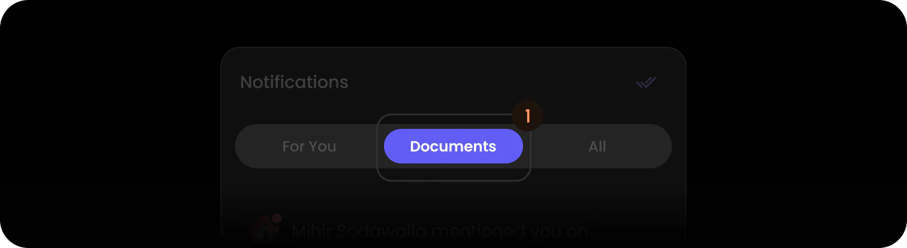
- React / Next.js
- Other Frameworks
<VeltWireframe>
    <VeltNotificationsPanelWireframe.Header.TabDocuments />
</VeltWireframe>
<velt-wireframe style="display:none;">
    <velt-notifications-panel-header-tab-documents-wireframe></velt-notifications-panel-header-tab-documents-wireframe>
</velt-wireframe>
TabForYou
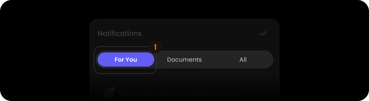
- React / Next.js
- Other Frameworks
<VeltWireframe>
    <VeltNotificationsPanelWireframe.Header.TabForYou />
</VeltWireframe>
<velt-wireframe style="display:none;">
    <velt-notifications-panel-header-tab-for-you-wireframe></velt-notifications-panel-header-tab-for-you-wireframe>
</velt-wireframe>
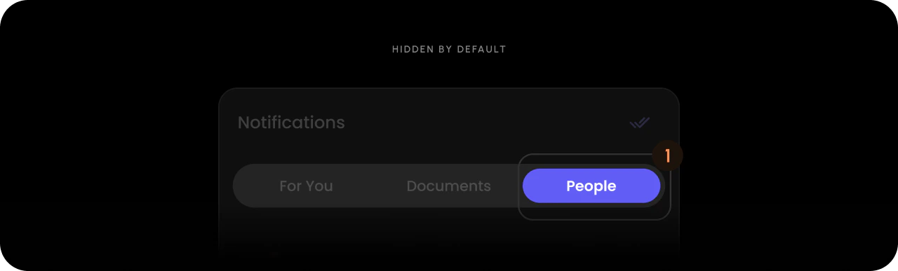
TabPeople
- React / Next.js
- Other Frameworks
<VeltWireframe>
    <VeltNotificationsPanelWireframe.Header.TabPeople />
</VeltWireframe>
<velt-wireframe style="display:none;">
    <velt-notifications-panel-header-tab-people-wireframe></velt-notifications-panel-header-tab-people-wireframe>
</velt-wireframe>
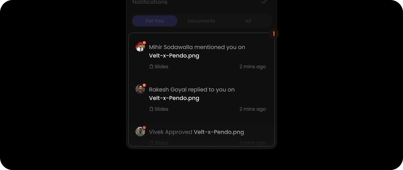
Content
- React / Next.js
- Other Frameworks
<VeltWireframe>
    <VeltNotificationsPanelWireframe.Content>
        <VeltNotificationsPanelWireframe.Content.ForYou />
        <VeltNotificationsPanelWireframe.Content.All />
        <VeltNotificationsPanelWireframe.Content.Documents />
        <VeltNotificationsPanelWireframe.Content.People />
    </VeltNotificationsPanelWireframe.Content>
</VeltWireframe>
<velt-wireframe style="display:none;">
    <velt-notifications-panel-content-wireframe>
        <velt-notifications-panel-content-for-you-wireframe></velt-notifications-panel-content-for-you-wireframe>
        <velt-notifications-panel-content-all-wireframe></velt-notifications-panel-content-all-wireframe>
        <velt-notifications-panel-content-documents-wireframe></velt-notifications-panel-content-documents-wireframe>
        <velt-notifications-panel-content-people-wireframe></velt-notifications-panel-content-people-wireframe>
    </velt-notifications-panel-content-wireframe>
</velt-wireframe>
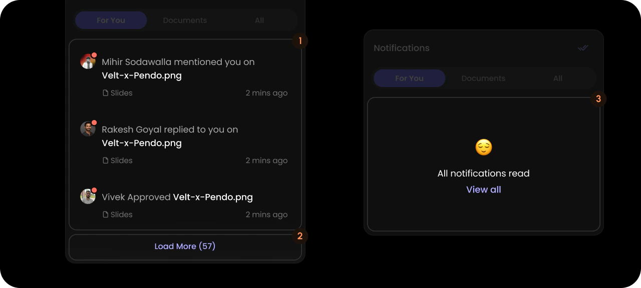
ForYou
- React / Next.js
- Other Frameworks
<VeltWireframe>
    <VeltNotificationsPanelWireframe.Content.ForYou>
        <VeltNotificationsPanelWireframe.Content.List />
        <VeltNotificationsPanelWireframe.Content.LoadMore />
        <VeltNotificationsPanelWireframe.Content.AllReadContainer />
    </VeltNotificationsPanelWireframe.Content.ForYou>
</VeltWireframe>
<velt-wireframe style="display:none;">
    <velt-notifications-panel-content-for-you-wireframe>
        <velt-notifications-panel-content-list-wireframe></velt-notifications-panel-content-list-wireframe>
        <velt-notifications-panel-content-load-more-wireframe></velt-notifications-panel-content-load-more-wireframe>
        <velt-notifications-panel-content-all-read-container-wireframe></velt-notifications-panel-content-all-read-container-wireframe>
    </velt-notifications-panel-content-for-you-wireframe>
</velt-wireframe>
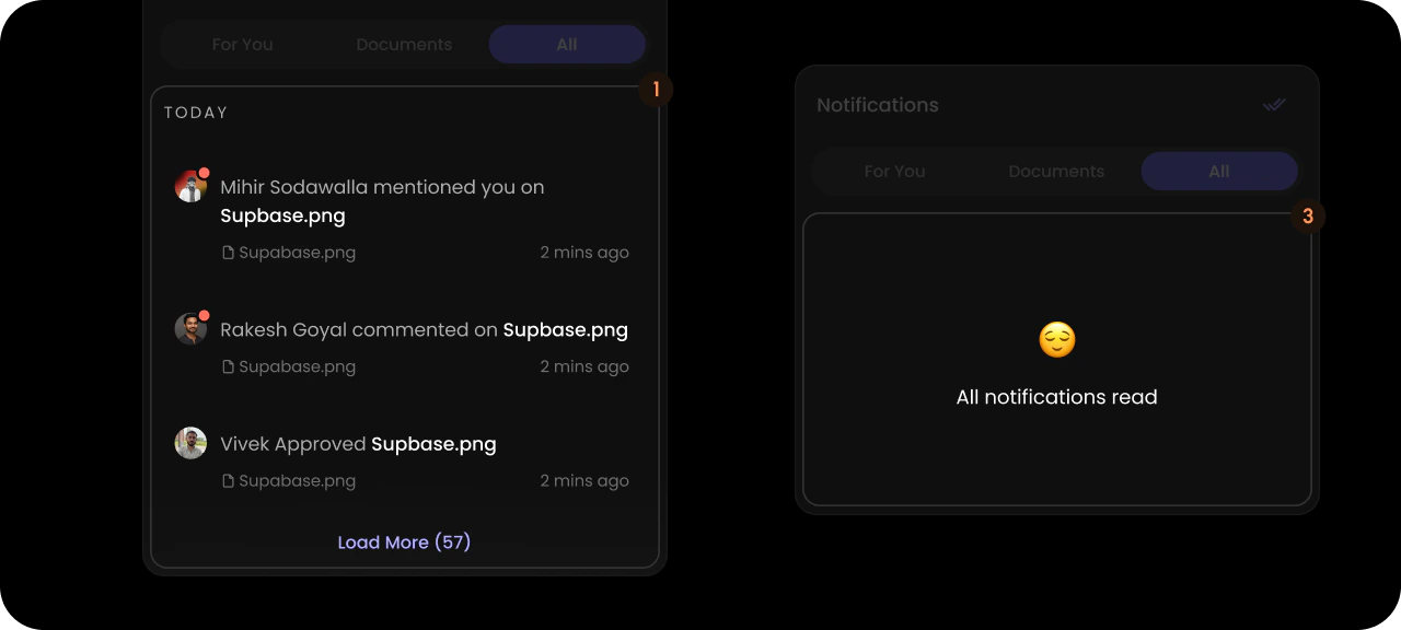
All
- React / Next.js
- Other Frameworks
<VeltWireframe>
    <VeltNotificationsPanelWireframe.Content.All>
        <VeltNotificationsPanelWireframe.Content.All.List />
        <VeltNotificationsPanelWireframe.Content.AllReadContainer />
    </VeltNotificationsPanelWireframe.Content.All>
</VeltWireframe>
<velt-wireframe style="display:none;">
    <velt-notifications-panel-content-all-wireframe>
        <velt-notifications-panel-content-all-list-wireframe></velt-notifications-panel-content-all-list-wireframe>
        <velt-notifications-panel-content-all-read-container-wireframe></velt-notifications-panel-content-all-read-container-wireframe>
    </velt-notifications-panel-content-all-wireframe>
</velt-wireframe>
All List
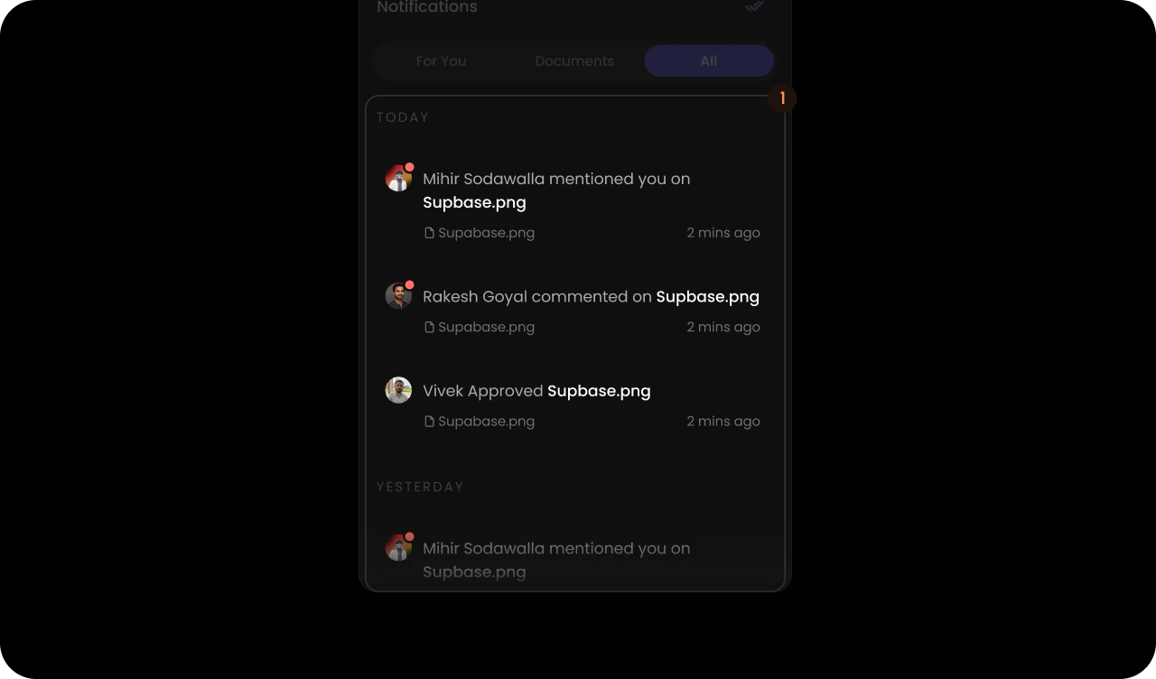
- React / Next.js
- Other Frameworks
<VeltWireframe>
    <VeltNotificationsPanelWireframe.Content.All.List>
        <VeltNotificationsPanelWireframe.Content.All.List.Item />
    </VeltNotificationsPanelWireframe.Content.All.List>
</VeltWireframe>
<velt-wireframe style="display:none;">
    <velt-notifications-panel-content-all-list-wireframe>
        <velt-notifications-panel-content-all-list-item-wireframe></velt-notifications-panel-content-all-list-item-wireframe>
    </velt-notifications-panel-content-all-list-wireframe>
</velt-wireframe>
All List Item
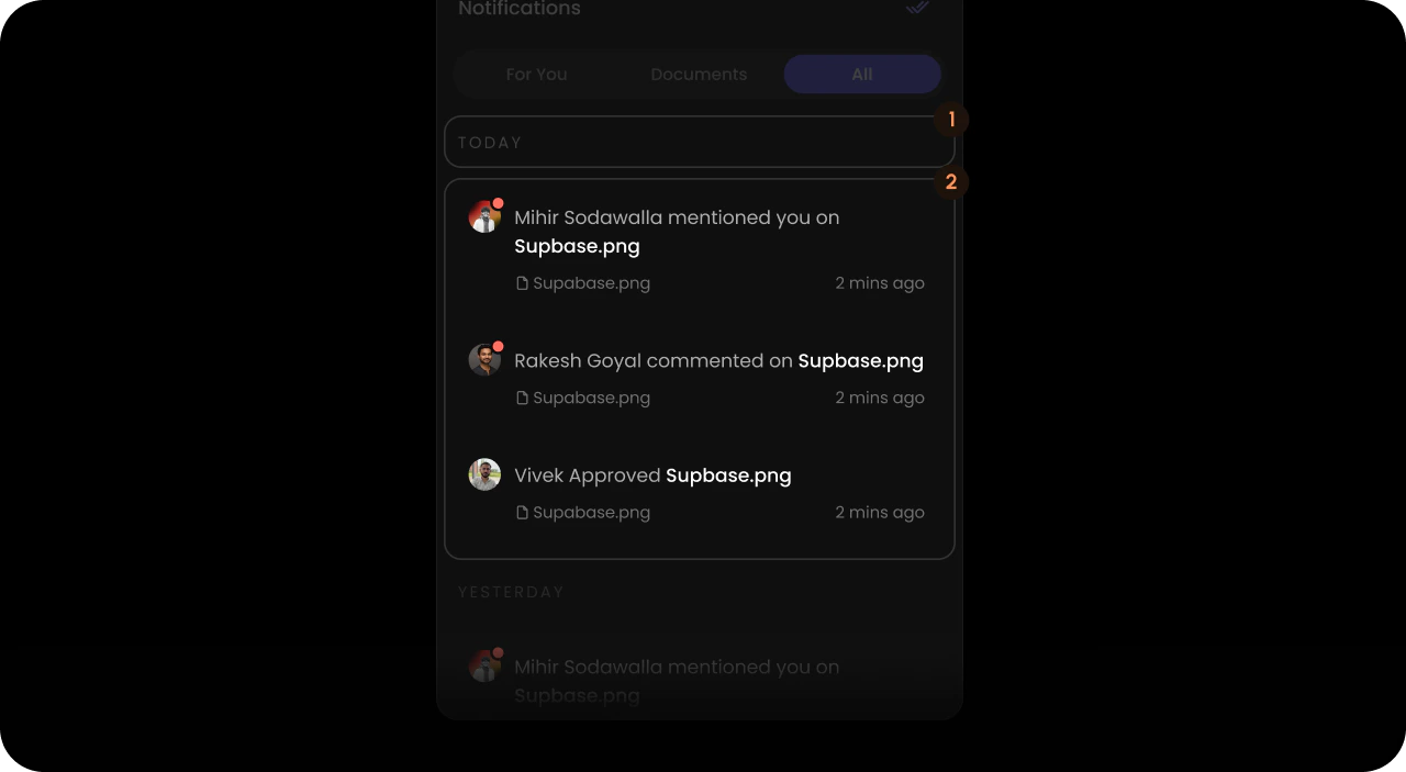
- React / Next.js
- Other Frameworks
<VeltWireframe>
    <VeltNotificationsPanelWireframe.Content.All.List.Item>
        <VeltNotificationsPanelWireframe.Content.All.List.Item.Label />
        <VeltNotificationsPanelWireframe.Content.All.List.Item.Content />
    </VeltNotificationsPanelWireframe.Content.All.List.Item>
</VeltWireframe>
<velt-wireframe style="display:none;">
    <velt-notifications-panel-content-all-list-item-wireframe>
        <velt-notifications-panel-content-all-list-item-label-wireframe></velt-notifications-panel-content-all-list-item-label-wireframe>
        <velt-notifications-panel-content-all-list-item-content-wireframe></velt-notifications-panel-content-all-list-item-content-wireframe>
    </velt-notifications-panel-content-all-list-item-wireframe>
</velt-wireframe>
All List Item Label

- React / Next.js
- Other Frameworks
<VeltWireframe>
    <VeltNotificationsPanelWireframe.Content.All.List.Item.Label />
</VeltWireframe>
<velt-wireframe style="display:none;">
    <velt-notifications-panel-content-all-list-item-label-wireframe></velt-notifications-panel-content-all-list-item-label-wireframe>
</velt-wireframe>
All List Item Content
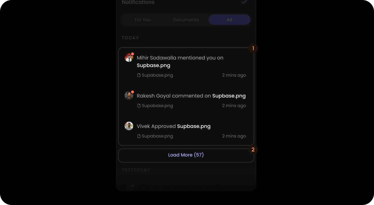
- React / Next.js
- Other Frameworks
<VeltWireframe>
    <VeltNotificationsPanelWireframe.Content.All.List.Item.Content>
        <VeltNotificationsPanelWireframe.Content.List />
        <VeltNotificationsPanelWireframe.Content.LoadMore />
    </VeltNotificationsPanelWireframe.Content.All.List.Item.Content>
</VeltWireframe>
<velt-wireframe style="display:none;">
    <velt-notifications-panel-content-all-list-item-content-wireframe>
        <velt-notifications-panel-content-list-wireframe></velt-notifications-panel-content-list-wireframe>
        <velt-notifications-panel-content-load-more-wireframe></velt-notifications-panel-content-load-more-wireframe>
    </velt-notifications-panel-content-all-list-item-content-wireframe>
</velt-wireframe>
Documents
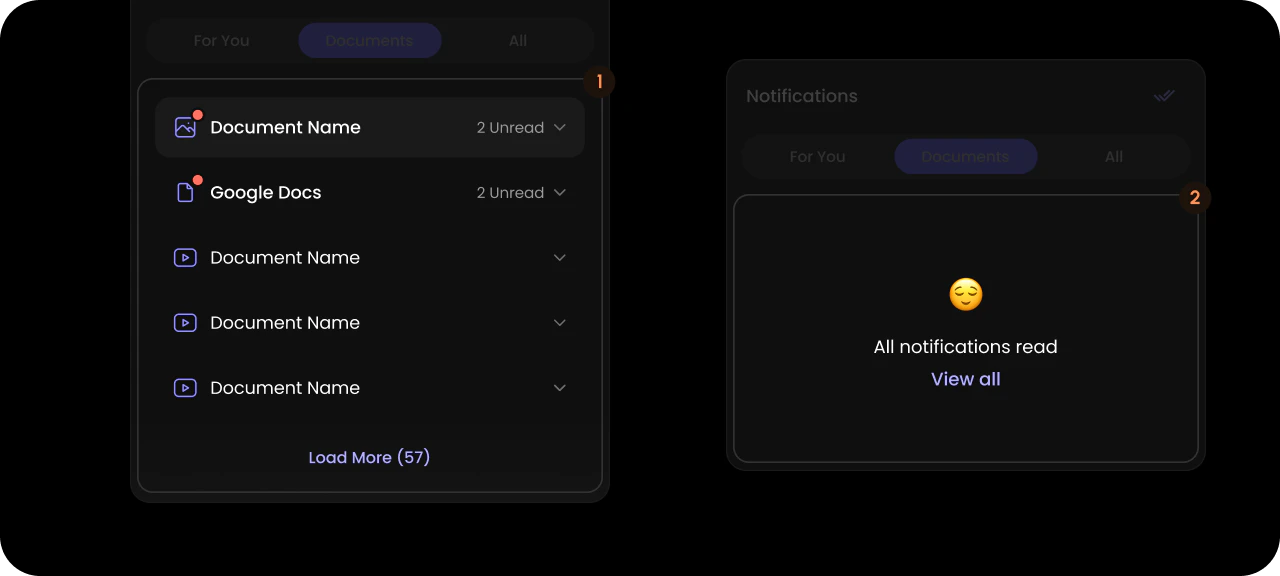
- React / Next.js
- Other Frameworks
<VeltWireframe>
    <VeltNotificationsPanelWireframe.Content.Documents>
        <VeltNotificationsPanelWireframe.Content.Documents.List />
        <VeltNotificationsPanelWireframe.Content.AllReadContainer />
    </VeltNotificationsPanelWireframe.Content.Documents>
</VeltWireframe>
<velt-wireframe style="display:none;">
    <velt-notifications-panel-content-documents-wireframe>
        <velt-notifications-panel-content-documents-list-wireframe></velt-notifications-panel-content-documents-list-wireframe>
        <velt-notifications-panel-content-all-read-container-wireframe></velt-notifications-panel-content-all-read-container-wireframe>
    </velt-notifications-panel-content-documents-wireframe>
</velt-wireframe>
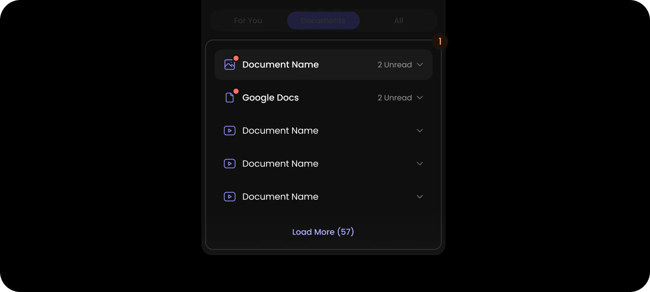
Documents List
- React / Next.js
- Other Frameworks
<VeltWireframe>
    <VeltNotificationsPanelWireframe.Content.Documents.List>
        <VeltNotificationsPanelWireframe.Content.Documents.List.Item />
    </VeltNotificationsPanelWireframe.Content.Documents.List>
</VeltWireframe>
<velt-wireframe style="display:none;">
    <velt-notifications-panel-content-documents-list-wireframe>
        <velt-notifications-panel-content-documents-list-item-wireframe></velt-notifications-panel-content-documents-list-item-wireframe>
    </velt-notifications-panel-content-documents-list-wireframe>
</velt-wireframe>
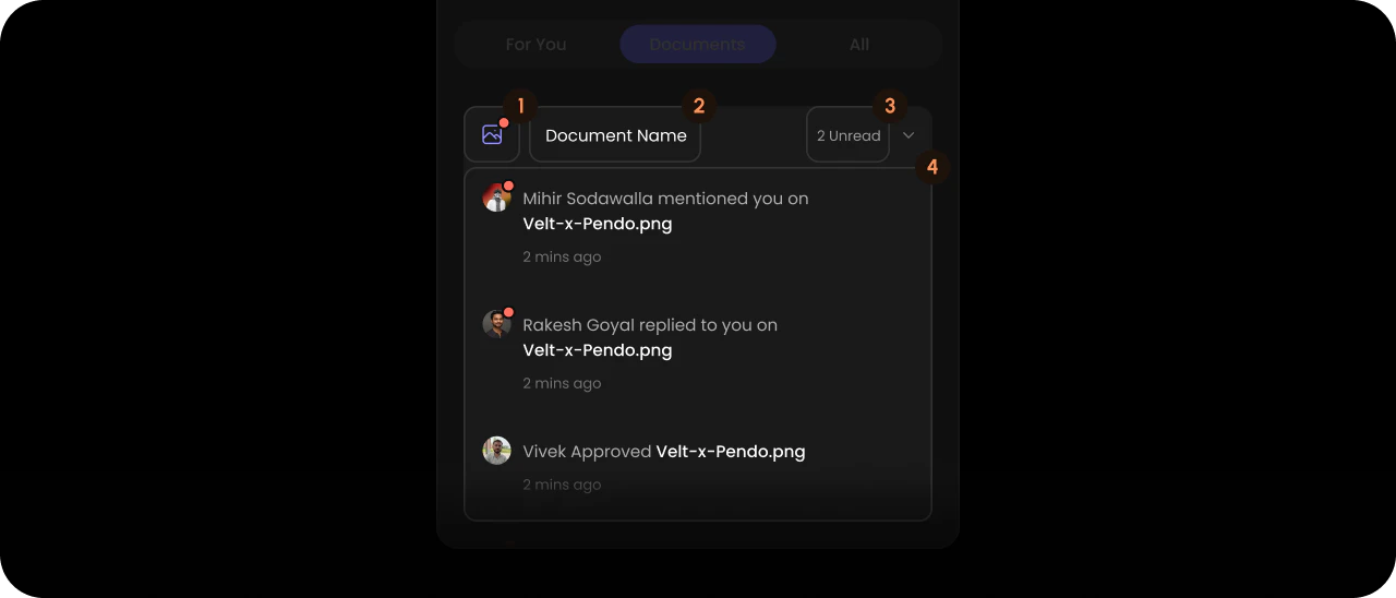
Documents List Item
- React / Next.js
- Other Frameworks
<VeltWireframe>
    <VeltNotificationsPanelWireframe.Content.Documents.List.Item>
        <VeltNotificationsPanelWireframe.Content.Documents.List.Item.Unread />
        <VeltNotificationsPanelWireframe.Content.Documents.List.Item.Name />
        <VeltNotificationsPanelWireframe.Content.Documents.List.Item.Count />
        <VeltNotificationsPanelWireframe.Content.Documents.List.Item.Content />
    </VeltNotificationsPanelWireframe.Content.Documents.List.Item>
</VeltWireframe>
<velt-wireframe style="display:none;">
    <velt-notifications-panel-content-documents-list-item-wireframe>
        <velt-notifications-panel-content-documents-list-item-unread-wireframe></velt-notifications-panel-content-documents-list-item-unread-wireframe>
        <velt-notifications-panel-content-documents-list-item-name-wireframe></velt-notifications-panel-content-documents-list-item-name-wireframe>
        <velt-notifications-panel-content-documents-list-item-count-wireframe></velt-notifications-panel-content-documents-list-item-count-wireframe>
        <velt-notifications-panel-content-documents-list-item-content-wireframe></velt-notifications-panel-content-documents-list-item-content-wireframe>
    </velt-notifications-panel-content-documents-list-item-wireframe>
</velt-wireframe>
Documents List Item Unread

- React / Next.js
- Other Frameworks
<VeltWireframe>
    <VeltNotificationsPanelWireframe.Content.Documents.List.Item.Unread />
</VeltWireframe>
<velt-wireframe style="display:none;">
    <velt-notifications-panel-content-documents-list-item-unread-wireframe></velt-notifications-panel-content-documents-list-item-unread-wireframe>
</velt-wireframe>
Documents List Item Name

- React / Next.js
- Other Frameworks
<VeltWireframe>
    <VeltNotificationsPanelWireframe.Content.Documents.List.Item.Name />
</VeltWireframe>
<velt-wireframe style="display:none;">
    <velt-notifications-panel-content-documents-list-item-name-wireframe></velt-notifications-panel-content-documents-list-item-name-wireframe>
</velt-wireframe>
Documents List Item Count

- React / Next.js
- Other Frameworks
<VeltWireframe>
    <VeltNotificationsPanelWireframe.Content.Documents.List.Item.Count />
</VeltWireframe>
<velt-wireframe style="display:none;">
    <velt-notifications-panel-content-documents-list-item-count-wireframe></velt-notifications-panel-content-documents-list-item-count-wireframe>
</velt-wireframe>
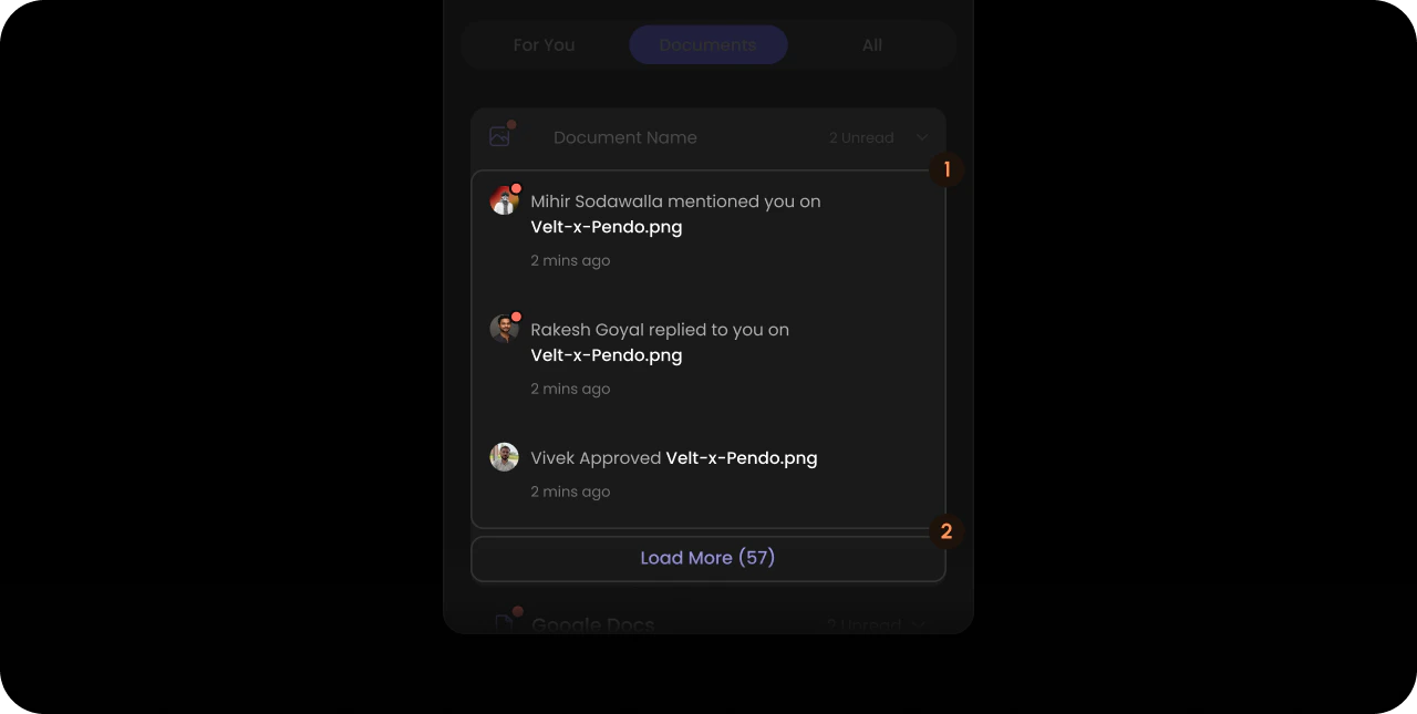
Documents List Item Content
- React / Next.js
- Other Frameworks
<VeltWireframe>
    <VeltNotificationsPanelWireframe.Content.Documents.List.Item.Content>
        <VeltNotificationsPanelWireframe.Content.List />
        <VeltNotificationsPanelWireframe.Content.LoadMore />
    </VeltNotificationsPanelWireframe.Content.Documents.List.Item.Content>
</VeltWireframe>
<velt-wireframe style="display:none;">
    <velt-notifications-panel-content-documents-list-item-content-wireframe>
        <velt-notifications-panel-content-list-wireframe></velt-notifications-panel-content-list-wireframe>
        <velt-notifications-panel-content-load-more-wireframe></velt-notifications-panel-content-load-more-wireframe>
    </velt-notifications-panel-content-documents-list-item-content-wireframe>
</velt-wireframe>
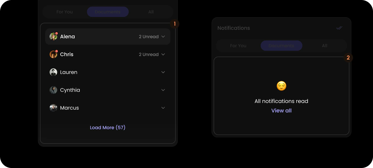
People
- React / Next.js
- Other Frameworks
<VeltWireframe>
    <VeltNotificationsPanelWireframe.Content.People>
        <VeltNotificationsPanelWireframe.Content.People.List />
        <VeltNotificationsPanelWireframe.Content.AllReadContainer />
    </VeltNotificationsPanelWireframe.Content.People>
</VeltWireframe>
<velt-wireframe style="display:none;">
    <velt-notifications-panel-content-people-wireframe>
        <velt-notifications-panel-content-people-list-wireframe></velt-notifications-panel-content-people-list-wireframe>
        <velt-notifications-panel-content-all-read-container-wireframe></velt-notifications-panel-content-all-read-container-wireframe>
    </velt-notifications-panel-content-people-wireframe>
</velt-wireframe>
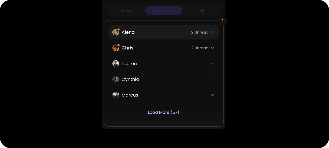
People List
- React / Next.js
- Other Frameworks
<VeltWireframe>
    <VeltNotificationsPanelWireframe.Content.People.List>
        <VeltNotificationsPanelWireframe.Content.People.List.Item />
    </VeltNotificationsPanelWireframe.Content.People.List>
</VeltWireframe>
<velt-wireframe style="display:none;">
    <velt-notifications-panel-content-people-list-wireframe>
        <velt-notifications-panel-content-people-list-item-wireframe></velt-notifications-panel-content-people-list-item-wireframe>
    </velt-notifications-panel-content-people-list-wireframe>
</velt-wireframe>
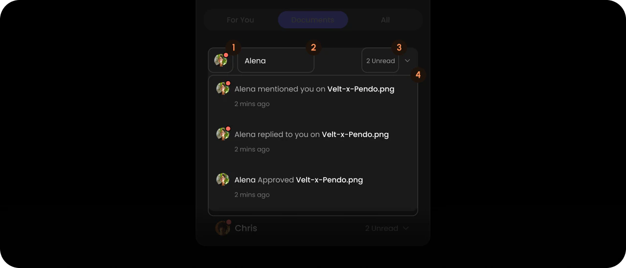
People List Item
- React / Next.js
- Other Frameworks
<VeltWireframe>
    <VeltNotificationsPanelWireframe.Content.People.List.Item>
        <VeltNotificationsPanelWireframe.Content.People.List.Item.Avatar />
        <VeltNotificationsPanelWireframe.Content.People.List.Item.Name />
        <VeltNotificationsPanelWireframe.Content.People.List.Item.Count />
        <VeltNotificationsPanelWireframe.Content.People.List.Item.Content />
    </VeltNotificationsPanelWireframe.Content.People.List.Item>
</VeltWireframe>
<velt-wireframe style="display:none;">
    <velt-notifications-panel-content-people-list-item-wireframe>
        <velt-notifications-panel-content-people-list-item-avatar-wireframe></velt-notifications-panel-content-people-list-item-avatar-wireframe>
        <velt-notifications-panel-content-people-list-item-name-wireframe></velt-notifications-panel-content-people-list-item-name-wireframe>
        <velt-notifications-panel-content-people-list-item-count-wireframe></velt-notifications-panel-content-people-list-item-count-wireframe>
        <velt-notifications-panel-content-people-list-item-content-wireframe></velt-notifications-panel-content-people-list-item-content-wireframe>
    </velt-notifications-panel-content-people-list-item-wireframe>
</velt-wireframe>
People List Item Avatar

- React / Next.js
- Other Frameworks
<VeltWireframe>
    <VeltNotificationsPanelWireframe.Content.People.List.Item.Avatar />
</VeltWireframe>
<velt-wireframe style="display:none;">
    <velt-notifications-panel-content-people-list-item-avatar-wireframe></velt-notifications-panel-content-people-list-item-avatar-wireframe>
</velt-wireframe>
People List Item Name

- React / Next.js
- Other Frameworks
<VeltWireframe>
    <VeltNotificationsPanelWireframe.Content.People.List.Item.Name />
</VeltWireframe>
<velt-wireframe style="display:none;">
    <velt-notifications-panel-content-people-list-item-name-wireframe></velt-notifications-panel-content-people-list-item-name-wireframe>
</velt-wireframe>
People List Item Count

- React / Next.js
- Other Frameworks
<VeltWireframe>
    <VeltNotificationsPanelWireframe.Content.People.List.Item.Count />
</VeltWireframe>
<velt-wireframe style="display:none;">
    <velt-notifications-panel-content-people-list-item-count-wireframe></velt-notifications-panel-content-people-list-item-count-wireframe>
</velt-wireframe>
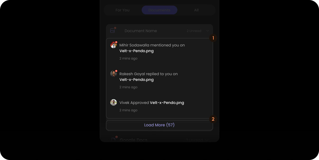
People List Item Content
- React / Next.js
- Other Frameworks
<VeltWireframe>
    <VeltNotificationsPanelWireframe.Content.People.List.Item.Content>
        <VeltNotificationsPanelWireframe.Content.List />
        <VeltNotificationsPanelWireframe.Content.LoadMore />
    </VeltNotificationsPanelWireframe.Content.People.List.Item.Content>
</VeltWireframe>
<velt-wireframe style="display:none;">
    <velt-notifications-panel-content-people-list-item-content-wireframe>
        <velt-notifications-panel-content-list-wireframe></velt-notifications-panel-content-list-wireframe>
        <velt-notifications-panel-content-load-more-wireframe></velt-notifications-panel-content-load-more-wireframe>
    </velt-notifications-panel-content-people-list-item-content-wireframe>
</velt-wireframe>
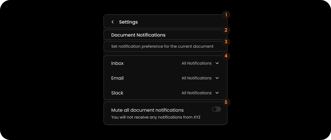
Settings
- React / Next.js
- Other Frameworks
<VeltWireframe>
    <VeltNotificationsPanelWireframe.Settings>
        <VeltNotificationsPanelWireframe.Settings.Header />
        <VeltNotificationsPanelWireframe.Settings.Title />
        <VeltNotificationsPanelWireframe.Settings.Description />
        <VeltNotificationsPanelWireframe.Settings.List />
        <VeltNotificationsPanelWireframe.Settings.Footer />
    </VeltNotificationsPanelWireframe.Settings>
</VeltWireframe>
<velt-wireframe style="display:none;">
    <velt-notifications-panel-settings-wireframe>
        <velt-notifications-panel-settings-header-wireframe></velt-notifications-panel-settings-header-wireframe>
        <velt-notifications-panel-settings-title-wireframe></velt-notifications-panel-settings-title-wireframe>
        <velt-notifications-panel-settings-description-wireframe></velt-notifications-panel-settings-description-wireframe>
        <velt-notifications-panel-settings-list-wireframe></velt-notifications-panel-settings-list-wireframe>
        <velt-notifications-panel-settings-footer-wireframe></velt-notifications-panel-settings-footer-wireframe>
    </velt-notifications-panel-settings-wireframe>
</velt-wireframe>
Settings Header

- React / Next.js
- Other Frameworks
<VeltWireframe>
    <VeltNotificationsPanelWireframe.Settings.Header>
        <VeltNotificationsPanelWireframe.Settings.BackButton />
        <VeltNotificationsPanelWireframe.Settings.Header.Title />
    </VeltNotificationsPanelWireframe.Settings.Header>
</VeltWireframe>
<velt-wireframe style="display:none;">
    <velt-notifications-panel-settings-header-wireframe>
        <velt-notifications-panel-settings-back-button-wireframe></velt-notifications-panel-settings-back-button-wireframe>
        <velt-notifications-panel-settings-header-title-wireframe></velt-notifications-panel-settings-header-title-wireframe>
    </velt-notifications-panel-settings-header-wireframe>
</velt-wireframe>
Header BackButton

- React / Next.js
- Other Frameworks
<VeltWireframe>
    <VeltNotificationsPanelWireframe.Settings.BackButton />
</VeltWireframe>
<velt-wireframe style="display:none;">
    <velt-notifications-panel-settings-back-button-wireframe></velt-notifications-panel-settings-back-button-wireframe>
</velt-wireframe>
Header Title

- React / Next.js
- Other Frameworks
<VeltWireframe>
    <VeltNotificationsPanelWireframe.Settings.Header.Title />
</VeltWireframe>
<velt-wireframe style="display:none;">
    <velt-notifications-panel-settings-header-title-wireframe></velt-notifications-panel-settings-header-title-wireframe>
</velt-wireframe>
Settings Title

- React / Next.js
- Other Frameworks
<VeltWireframe>
    <VeltNotificationsPanelWireframe.Settings.Title />
</VeltWireframe>
<velt-wireframe style="display:none;">
    <velt-notifications-panel-settings-title-wireframe></velt-notifications-panel-settings-title-wireframe>
</velt-wireframe>
Settings Description

- React / Next.js
- Other Frameworks
<VeltWireframe>
    <VeltNotificationsPanelWireframe.Settings.Description />
</VeltWireframe>
<velt-wireframe style="display:none;">
    <velt-notifications-panel-settings-description-wireframe></velt-notifications-panel-settings-description-wireframe>
</velt-wireframe>
Settings List
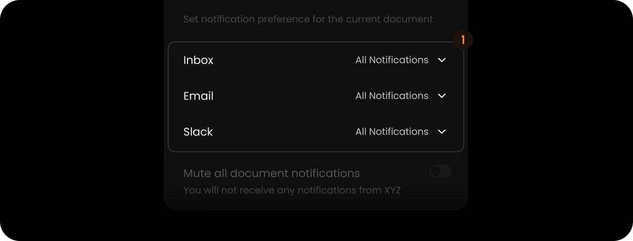
- React / Next.js
- Other Frameworks
<VeltWireframe>
    <VeltNotificationsPanelWireframe.Settings.List>
        <VeltNotificationsPanelWireframe.Settings.List.Accordion />
    </VeltNotificationsPanelWireframe.Settings.List>
</VeltWireframe>
<velt-wireframe style="display:none;">
    <velt-notifications-panel-settings-list-wireframe>
        <velt-notifications-panel-settings-accordion-wireframe></velt-notifications-panel-settings-accordion-wireframe>
    </velt-notifications-panel-settings-list-wireframe>
</velt-wireframe>
Settings List Accordion
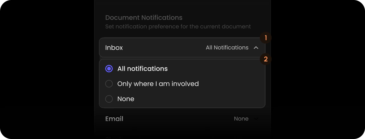
- React / Next.js
- Other Frameworks
<VeltWireframe>
    <VeltNotificationsPanelWireframe.Settings.List.Accordion>
        <VeltNotificationsPanelWireframe.Settings.List.Accordion.Trigger />
        <VeltNotificationsPanelWireframe.Settings.List.Accordion.Content />
    </VeltNotificationsPanelWireframe.Settings.List.Accordion>
</VeltWireframe>
<velt-wireframe style="display:none;">
    <velt-notifications-panel-settings-accordion-wireframe>
        <velt-notifications-panel-settings-accordion-trigger-wireframe></velt-notifications-panel-settings-accordion-trigger-wireframe>
        <velt-notifications-panel-settings-accordion-content-wireframe></velt-notifications-panel-settings-accordion-content-wireframe>
    </velt-notifications-panel-settings-accordion-wireframe>
</velt-wireframe>
Accordion Trigger

- React / Next.js
- Other Frameworks
<VeltWireframe>
    <VeltNotificationsPanelWireframe.Settings.List.Accordion.Trigger>
        <VeltNotificationsPanelWireframe.Settings.List.Accordion.Trigger.Label />
        <VeltNotificationsPanelWireframe.Settings.List.Accordion.Trigger.SelectedValue />
        <VeltNotificationsPanelWireframe.Settings.List.Accordion.Trigger.Icon />
    </VeltNotificationsPanelWireframe.Settings.List.Accordion.Trigger>
</VeltWireframe>
<velt-wireframe style="display:none;">
    <velt-notifications-panel-settings-accordion-trigger-wireframe>
        <velt-notifications-panel-settings-accordion-trigger-label-wireframe></velt-notifications-panel-settings-accordion-trigger-label-wireframe>
        <velt-notifications-panel-settings-accordion-trigger-selected-value-wireframe></velt-notifications-panel-settings-accordion-trigger-selected-value-wireframe>
        <velt-notifications-panel-settings-accordion-trigger-icon-wireframe></velt-notifications-panel-settings-accordion-trigger-icon-wireframe>
    </velt-notifications-panel-settings-accordion-trigger-wireframe>
</velt-wireframe>
Accordion Trigger Label

- React / Next.js
- Other Frameworks
<VeltWireframe>
    <VeltNotificationsPanelWireframe.Settings.List.Accordion.Trigger.Label />
</VeltWireframe>
<velt-wireframe style="display:none;">
    <velt-notifications-panel-settings-accordion-trigger-label-wireframe></velt-notifications-panel-settings-accordion-trigger-label-wireframe>
</velt-wireframe>
Accordion Trigger SelectedValue

- React / Next.js
- Other Frameworks
<VeltWireframe>
    <VeltNotificationsPanelWireframe.Settings.List.Accordion.Trigger.SelectedValue />
</VeltWireframe>
<velt-wireframe style="display:none;">
    <velt-notifications-panel-settings-accordion-trigger-selected-value-wireframe></velt-notifications-panel-settings-accordion-trigger-selected-value-wireframe>
</velt-wireframe>
Accordion Trigger Icon

- React / Next.js
- Other Frameworks
<VeltWireframe>
    <VeltNotificationsPanelWireframe.Settings.List.Accordion.Trigger.Icon />
</VeltWireframe>
<velt-wireframe style="display:none;">
    <velt-notifications-panel-settings-accordion-trigger-icon-wireframe></velt-notifications-panel-settings-accordion-trigger-icon-wireframe>
</velt-wireframe>
Accordion Content
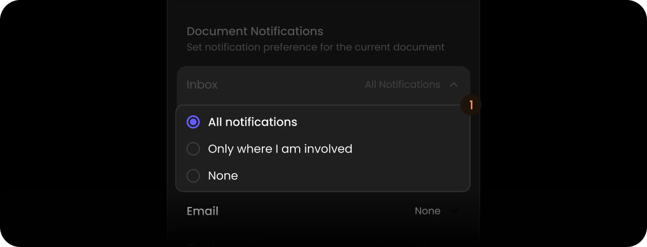
- React / Next.js
- Other Frameworks
<VeltWireframe>
    <VeltNotificationsPanelWireframe.Settings.List.Accordion.Content>
        <VeltNotificationsPanelWireframe.Settings.List.Accordion.Content.Item />
    </VeltNotificationsPanelWireframe.Settings.List.Accordion.Content>
</VeltWireframe>
<velt-wireframe style="display:none;">
    <velt-notifications-panel-settings-accordion-content-wireframe>
        <velt-notifications-panel-settings-accordion-content-item-wireframe></velt-notifications-panel-settings-accordion-content-item-wireframe>
    </velt-notifications-panel-settings-accordion-content-wireframe>
</velt-wireframe>
Accordion Content Item
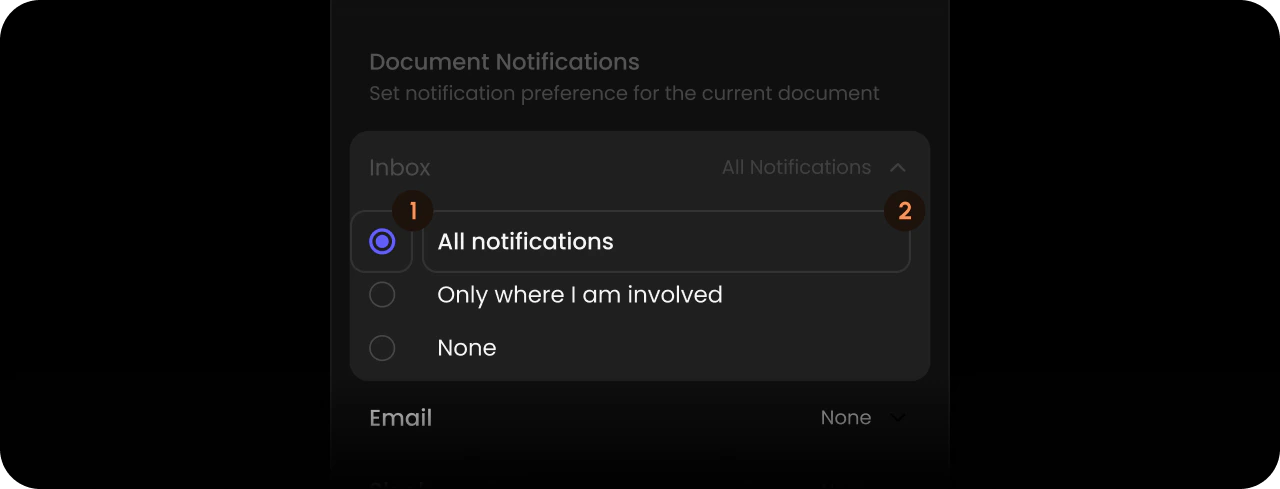
- React / Next.js
- Other Frameworks
<VeltWireframe>
    <VeltNotificationsPanelWireframe.Settings.List.Accordion.Content.Item>
        <VeltNotificationsPanelWireframe.Settings.List.Accordion.Content.Item.Icon />
        <VeltNotificationsPanelWireframe.Settings.List.Accordion.Content.Item.Label />
    </VeltNotificationsPanelWireframe.Settings.List.Accordion.Content.Item>
</VeltWireframe>
<velt-wireframe style="display:none;">
    <velt-notifications-panel-settings-accordion-content-item-wireframe>
        <velt-notifications-panel-settings-accordion-content-item-icon-wireframe></velt-notifications-panel-settings-accordion-content-item-icon-wireframe>
        <velt-notifications-panel-settings-accordion-content-item-label-wireframe></velt-notifications-panel-settings-accordion-content-item-label-wireframe>
    </velt-notifications-panel-settings-accordion-content-item-wireframe>
</velt-wireframe>
Accordion Content Item Icon

- React / Next.js
- Other Frameworks
<VeltWireframe>
    <VeltNotificationsPanelWireframe.Settings.List.Accordion.Content.Item.Icon />
</VeltWireframe>
<velt-wireframe style="display:none;">
    <velt-notifications-panel-settings-accordion-content-item-icon-wireframe></velt-notifications-panel-settings-accordion-content-item-icon-wireframe>
</velt-wireframe>
Accordion Content Item Label

- React / Next.js
- Other Frameworks
<VeltWireframe>
    <VeltNotificationsPanelWireframe.Settings.List.Accordion.Content.Item.Label />
</VeltWireframe>
<velt-wireframe style="display:none;">
    <velt-notifications-panel-settings-accordion-content-item-label-wireframe></velt-notifications-panel-settings-accordion-content-item-label-wireframe>
</velt-wireframe>
Settings Footer

- React / Next.js
- Other Frameworks
<VeltWireframe>
    <VeltNotificationsPanelWireframe.Settings.Footer>
        <VeltNotificationsPanelWireframe.Settings.MuteAllTitle />
        <VeltNotificationsPanelWireframe.Settings.MuteAllDescription />
        <VeltNotificationsPanelWireframe.Settings.MuteAllToggle />
    </VeltNotificationsPanelWireframe.Settings.Footer>
</VeltWireframe>
<velt-wireframe style="display:none;">
    <velt-notifications-panel-settings-footer-wireframe>
        <velt-notifications-panel-settings-mute-all-title-wireframe></velt-notifications-panel-settings-mute-all-title-wireframe>
        <velt-notifications-panel-settings-mute-all-description-wireframe></velt-notifications-panel-settings-mute-all-description-wireframe>
        <velt-notifications-panel-settings-mute-all-toggle-wireframe></velt-notifications-panel-settings-mute-all-toggle-wireframe>
    </velt-notifications-panel-settings-footer-wireframe>
</velt-wireframe>
MuteAllTitle

- React / Next.js
- Other Frameworks
<VeltWireframe>
    <VeltNotificationsPanelWireframe.Settings.MuteAllTitle />
</VeltWireframe>
<velt-wireframe style="display:none;">
    <velt-notifications-panel-settings-mute-all-title-wireframe></velt-notifications-panel-settings-mute-all-title-wireframe>
</velt-wireframe>
MuteAllDescription

- React / Next.js
- Other Frameworks
<VeltWireframe>
    <VeltNotificationsPanelWireframe.Settings.MuteAllDescription />
</VeltWireframe>
<velt-wireframe style="display:none;">
    <velt-notifications-panel-settings-mute-all-description-wireframe></velt-notifications-panel-settings-mute-all-description-wireframe>
</velt-wireframe>
MuteAllToggle

- React / Next.js
- Other Frameworks
<VeltWireframe>
    <VeltNotificationsPanelWireframe.Settings.MuteAllToggle />
</VeltWireframe>
<velt-wireframe style="display:none;">
    <velt-notifications-panel-settings-mute-all-toggle-wireframe></velt-notifications-panel-settings-mute-all-toggle-wireframe>
</velt-wireframe>
Shared Components
Content List
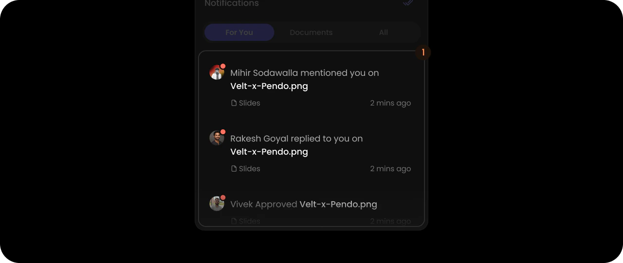
- React / Next.js
- Other Frameworks
<VeltWireframe>
    <VeltNotificationsPanelWireframe.Content.List>
        <VeltNotificationsPanelWireframe.Content.List.Item />
    </VeltNotificationsPanelWireframe.Content.List>
</VeltWireframe>
<velt-wireframe style="display:none;">
    <velt-notifications-panel-content-list-wireframe>
        <velt-notifications-panel-content-list-item-wireframe></velt-notifications-panel-content-list-item-wireframe>
    </velt-notifications-panel-content-list-wireframe>
</velt-wireframe>
Content List Item
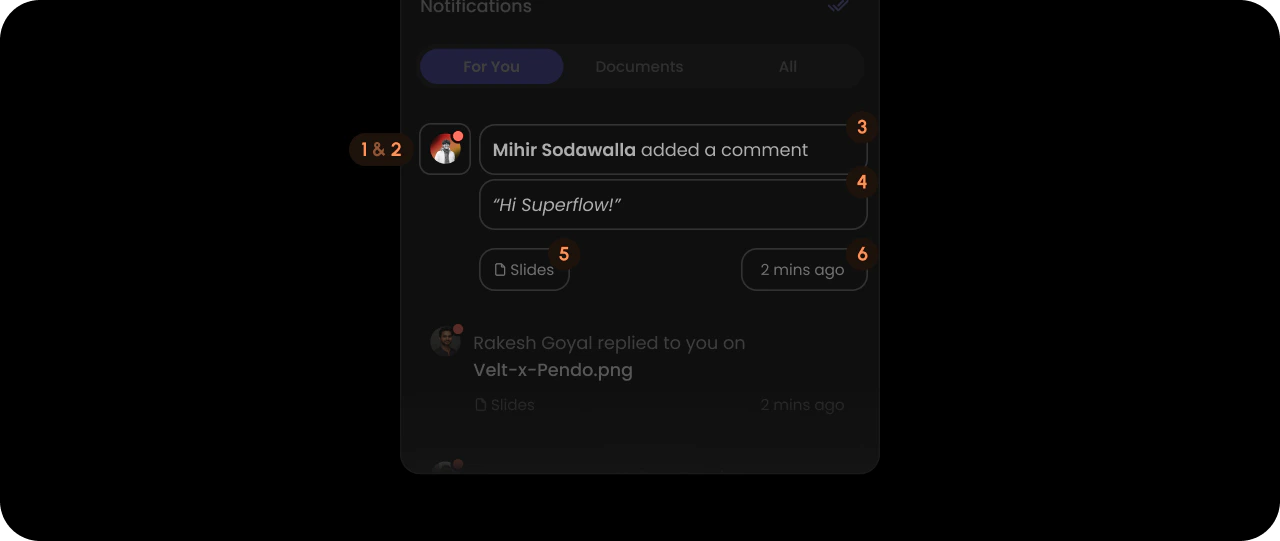
- React / Next.js
- Other Frameworks
<VeltWireframe>
    <VeltNotificationsPanelWireframe.Content.List.Item>
        <VeltNotificationsPanelWireframe.Content.List.Item.Avatar />
        <VeltNotificationsPanelWireframe.Content.List.Item.Unread />
        <VeltNotificationsPanelWireframe.Content.List.Item.Headline />
        <VeltNotificationsPanelWireframe.Content.List.Item.Body />
        <VeltNotificationsPanelWireframe.Content.List.Item.FileName />
        <VeltNotificationsPanelWireframe.Content.List.Item.Time />
    </VeltNotificationsPanelWireframe.Content.List.Item>
</VeltWireframe>
<velt-wireframe style="display:none;">
    <velt-notifications-panel-content-list-item-wireframe>
        <velt-notifications-panel-content-list-item-avatar-wireframe></velt-notifications-panel-content-list-item-avatar-wireframe>
        <velt-notifications-panel-content-list-item-unread-wireframe></velt-notifications-panel-content-list-item-unread-wireframe>
        <velt-notifications-panel-content-list-item-headline-wireframe></velt-notifications-panel-content-list-item-headline-wireframe>
        <velt-notifications-panel-content-list-item-body-wireframe></velt-notifications-panel-content-list-item-body-wireframe>
        <velt-notifications-panel-content-list-item-file-name-wireframe></velt-notifications-panel-content-list-item-file-name-wireframe>
        <velt-notifications-panel-content-list-item-time-wireframe></velt-notifications-panel-content-list-item-time-wireframe>
    </velt-notifications-panel-content-list-item-wireframe>
</velt-wireframe>
Content List Item Avatar

- React / Next.js
- Other Frameworks
<VeltWireframe>
    <VeltNotificationsPanelWireframe.Content.List.Item.Avatar />
</VeltWireframe>
<velt-wireframe style="display:none;">
    <velt-notifications-panel-content-list-item-avatar-wireframe></velt-notifications-panel-content-list-item-avatar-wireframe>
</velt-wireframe>
Content List Item Unread

- React / Next.js
- Other Frameworks
<VeltWireframe>
    <VeltNotificationsPanelWireframe.Content.List.Item.Unread />
</VeltWireframe>
<velt-wireframe style="display:none;">
    <velt-notifications-panel-content-list-item-unread-wireframe></velt-notifications-panel-content-list-item-unread-wireframe>
</velt-wireframe>
Content List Item Headline

- React / Next.js
- Other Frameworks
<VeltWireframe>
    <VeltNotificationsPanelWireframe.Content.List.Item.Headline />
</VeltWireframe>
<velt-wireframe style="display:none;">
    <velt-notifications-panel-content-list-item-headline-wireframe></velt-notifications-panel-content-list-item-headline-wireframe>
</velt-wireframe>
Content List Item Body

- React / Next.js
- Other Frameworks
<VeltWireframe>
    <VeltNotificationsPanelWireframe.Content.List.Item.Body />
</VeltWireframe>
<velt-wireframe style="display:none;">
    <velt-notifications-panel-content-list-item-body-wireframe></velt-notifications-panel-content-list-item-body-wireframe>
</velt-wireframe>
Content List Item FileName

- React / Next.js
- Other Frameworks
<VeltWireframe>
    <VeltNotificationsPanelWireframe.Content.List.Item.FileName />
</VeltWireframe>
<velt-wireframe style="display:none;">
    <velt-notifications-panel-content-list-item-file-name-wireframe></velt-notifications-panel-content-list-item-file-name-wireframe>
</velt-wireframe>
Content List Item Time

- React / Next.js
- Other Frameworks
<VeltWireframe>
    <VeltNotificationsPanelWireframe.Content.List.Item.Time />
</VeltWireframe>
<velt-wireframe style="display:none;">
    <velt-notifications-panel-content-list-item-time-wireframe></velt-notifications-panel-content-list-item-time-wireframe>
</velt-wireframe>
LoadMore

- React / Next.js
- Other Frameworks
<VeltWireframe>
    <VeltNotificationsPanelWireframe.Content.LoadMore />
</VeltWireframe>
<velt-wireframe style="display:none;">
    <velt-notifications-panel-content-load-more-wireframe></velt-notifications-panel-content-load-more-wireframe>
</velt-wireframe>
AllReadContainer
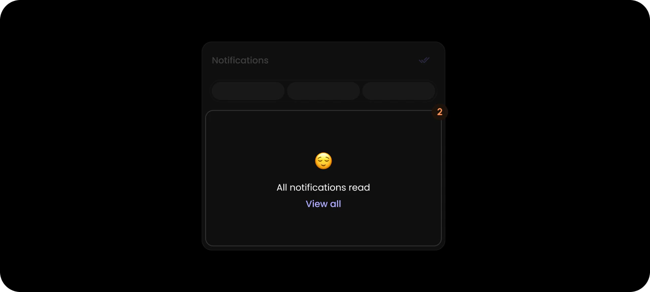
- React / Next.js
- Other Frameworks
<VeltWireframe>
    <VeltNotificationsPanelWireframe.Content.AllReadContainer />
</VeltWireframe>
<velt-wireframe style="display:none;">
    <velt-notifications-panel-content-all-read-container-wireframe></velt-notifications-panel-content-all-read-container-wireframe>
</velt-wireframe>
Styling
Disable ShadowDOM
- By default, ShadowDOM is used to ensure that your app’s CSS does not interfere with the styling of the SDK components.
- Disable the shadow dom to apply your custom CSS to the component.
Default: true
- React / Next.js
- Other Frameworks
<VeltNotificationsPanel shadowDom={false} />
<velt-notifications-panel shadow-dom="false"></velt-notifications-panel>
Dark Mode
Default: false
- React / Next.js
- Other Frameworks
<VeltNotificationsPanel darkMode={true} />
<velt-notifications-panel dark-mode="true"></velt-notifications-panel>